Air Quality Index across year in NY state
Air Quality Index
Figure 1: Air Quality Index by counties in NY State, 2003-2012
aqi_state_graph =
  aqi_year_df %>%
  group_by(county) %>%
  ggplot(aes(x = year, y = aqi_mean, color = county)) +
  geom_point(alpha=.3) +
  geom_line() +
  labs(
    title = "Air Quality Index by county in NY state, 2003-2012",
    x = "Year",
    y = "Air Quality Index"
  )+
  scale_x_continuous(breaks = 2003:2012 )+
  scale_color_viridis(
    name = "County",
    discrete = TRUE
  )

aqi_state_graph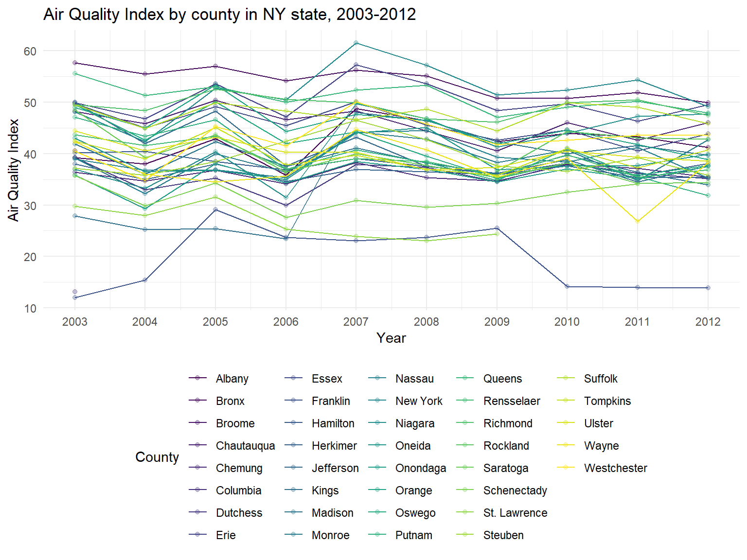
- According to the graph, we can find that some counties are with a
high air quality among 10 years, reaching 50-60(Moderate), for example,
New York,Bronx,ErieandQueens. However, some counties are with lower air quality index, as lower as 10-30, for example,Franklin,Columbia,St. LawrenceandKings. - It can be seen that air quality in most of counties are decreasing among 10 years, which means that air quality in NY state is getting better.
Figure 2: Mean AQI for different counties in NY State, 2003-2012
aqi_county_graph =
  aqi_year_df %>%
  group_by(county) %>%
  summarize(
    aqi_all = mean(aqi_mean),
    max = max(aqi_mean),
    min = min(aqi_mean)
  ) %>%
  mutate(county = fct_reorder(county, aqi_all)) %>%
  ggplot(aes(x = county, y = aqi_all)) +
  geom_point()+
  geom_errorbar(mapping = aes(ymin = min, ymax = max)) +
  labs( x = "County",  y = "Air Quality Index", title = "Mean AQI for different counties in NY State, 2003-2012") +
  theme(plot.title = element_text(hjust = 0.5)) +
  theme(axis.text.x = element_text(angle = 90, vjust = 0.5, hjust = 1))

aqi_county_graph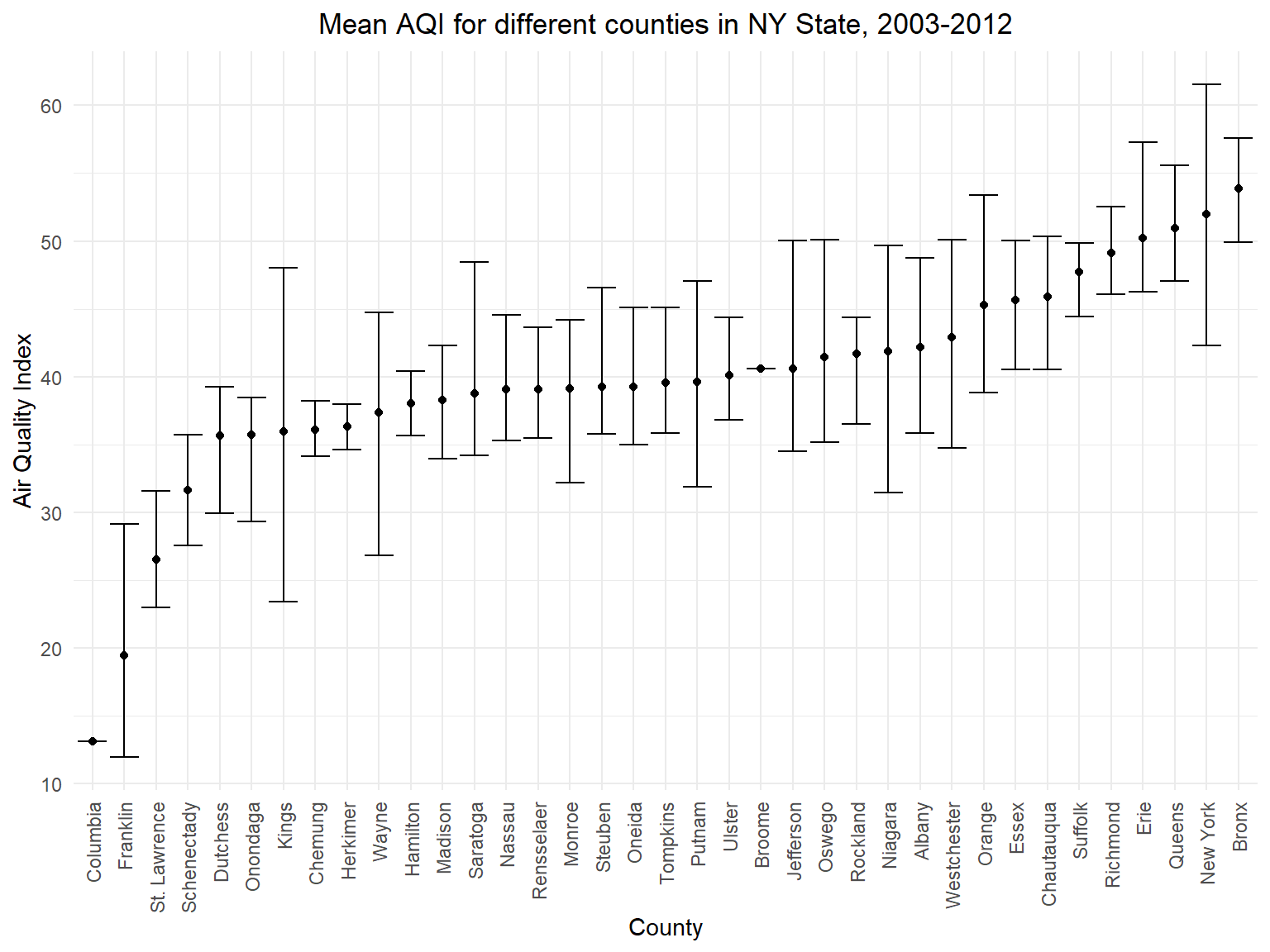
- This graph is based on mean air quality among 10 years in different
counties. According to this graph, we can directly find the top 5
counties with worst air quality(
Bronx,New York,Queens,ErieandRichmond) and top 5 counties with best air quality(Columbia,Franklin,St. Lawrence,SchenectadyandDutchess)
Figure 3: AQI by counties in NY State on map
air_county_df =
  aqi_year_df %>%
  group_by(state_code, county_code,county) %>%
  summarize(
    aqi_all = mean(aqi_mean),
    max = max(aqi_mean),
    min = min(aqi_mean)
  ) %>%
  mutate(
    fips = str_c(state_code,county_code)
  )

county_plot_map =
  plot_usmap(regions = "county", include = c("NY"), data = air_county_df, values = "aqi_all", labels = TRUE, label_color = "white") +
  scale_fill_continuous(
    low = "white", high = "Red", name = "Air Quality Index", label = scales::comma, limits = c(0,60)
  ) +
  labs(
    title = "AQI by counties in NY State on mapp"
  )+
  theme(legend.position = "right")

county_plot_map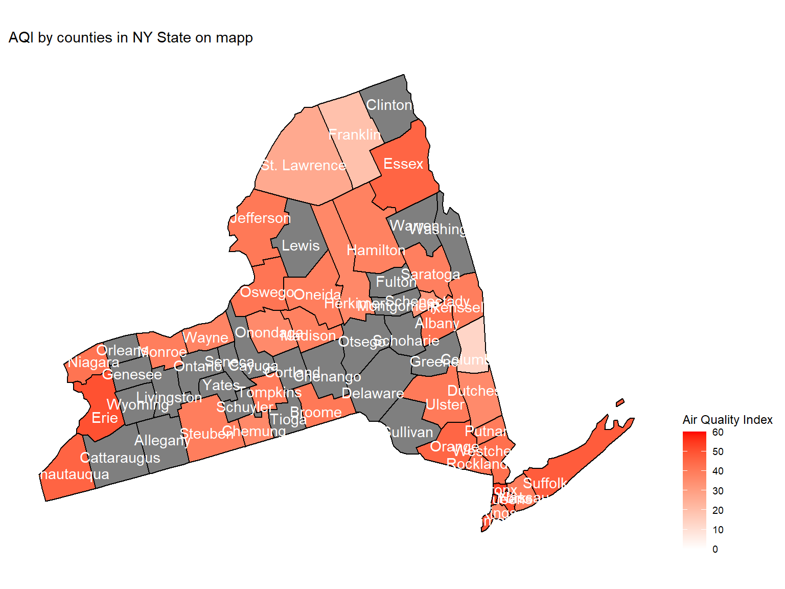
- Maps can help us directly view the air quality in counties. This map is based on mean air quality index among 10 years.
Figure 4: Unhealthy air quality days by counties in NY State, 2003-2012
air_quality_day_df =
  air_daily_df %>%
  group_by(state_code, county_code,county) %>%
  mutate(
    aqi_status = case_when(
      category %in% c("Good", "Moderate") ~ "Healthy",
      category %in% c("Unhealthy for Sensitive Groups", "Unhealthy", "Very Unhealthy") ~ "Unhealthy"
    )
  )

Unhealthy_air_graph =
  air_quality_day_df %>%
  filter(aqi_status == "Unhealthy") %>%
  group_by(county) %>%
  summarize(
    unhealthy_days = n()
  ) %>%
  mutate(
    county = fct_reorder(county, unhealthy_days)
    ) %>%
  ggplot(aes(y = county, x = unhealthy_days, fill = unhealthy_days)) +
  geom_col() +
  labs(
    title = "Unhealthy air quality days by counties in NY State, 2003-2012",
    x = "Unhealthy air quality days",
    y = "County"
  ) +
  scale_fill_viridis(option = "turbo")

Unhealthy_air_graph 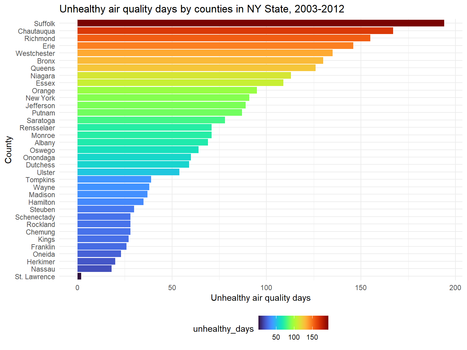
- According to the classification, the air is defined as unhealthy
when air quality index is higher than 100. Based on the graph, we can
know that top 5 counties with the most unhealthy air quality days are
Suffolk,Chautauqua,Richmond,ErieandWestchester.