Type of Pollutants in each counties
Defining Pollutants
Figure 5: Defining pollutants distribution among 10 years in NY State
pollutants_graph =
  air_quality_day_df %>%
  group_by(defining_parameter) %>%
  summarize(
    pollutants = n()
  ) %>%
  mutate(
    defining_parameter = fct_reorder(defining_parameter, pollutants)
    ) %>%
  ggplot(aes(x = defining_parameter, y = pollutants, fill = pollutants)) +
  geom_col() +
  labs(
    title = "Defining pollutants distribution among 10 years in NY State",
    x = "Defining pollutants",
    y = "days"
  ) +
  scale_fill_viridis(option = "turbo")

pollutants_graph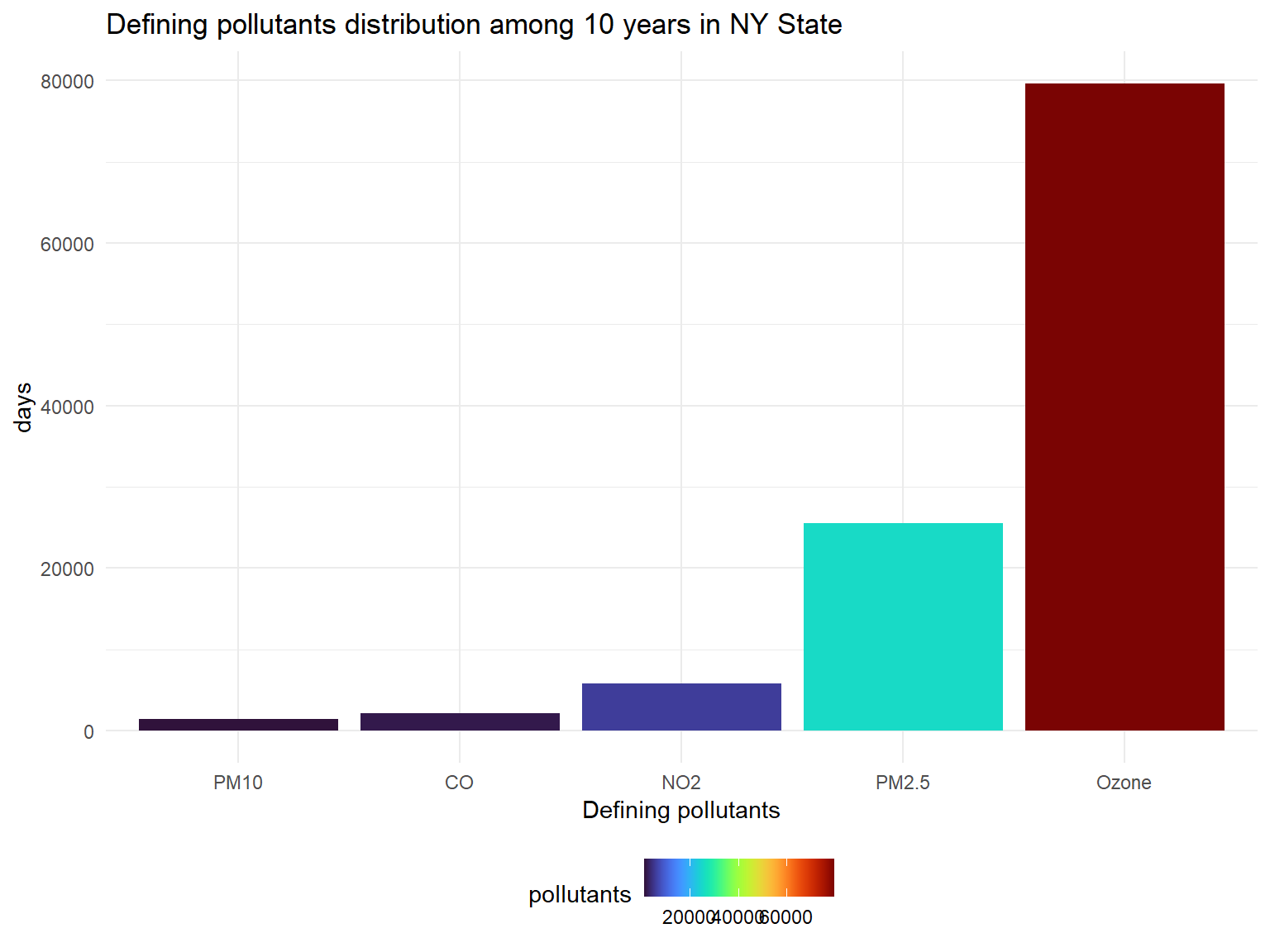
- Defining pollutants is the most important pollutants in one day in a
place. If there is no other pollutants that exceeds the control line,
the defining pollutants is
Ozone. Based on the graph, we can know that except forOzone,PM2.5andNO2are pollutants that affect NY state in past 10 years.
Figure 6: Defining pollutants distribution in unhealthy air quality days among 10 years in NY State
Unhealthy_pollutants_graph =
  air_quality_day_df %>%
  filter(aqi_status == "Unhealthy") %>%
  group_by(defining_parameter) %>%
  summarize(
    pollutants = n()
  ) %>%
  mutate(
    defining_parameter = fct_reorder(defining_parameter, pollutants)
    ) %>%
  ggplot(aes(x = defining_parameter, y = pollutants, fill = pollutants)) +
  geom_col() +
  labs(
    title = "Defining pollutants distribution in unhealthy air quality days among 10 years in NY State",
    x = "Defining pollutants",
    y = "Unhealthy air quality days"
  ) +
  scale_fill_viridis(option = "turbo")

Unhealthy_pollutants_graph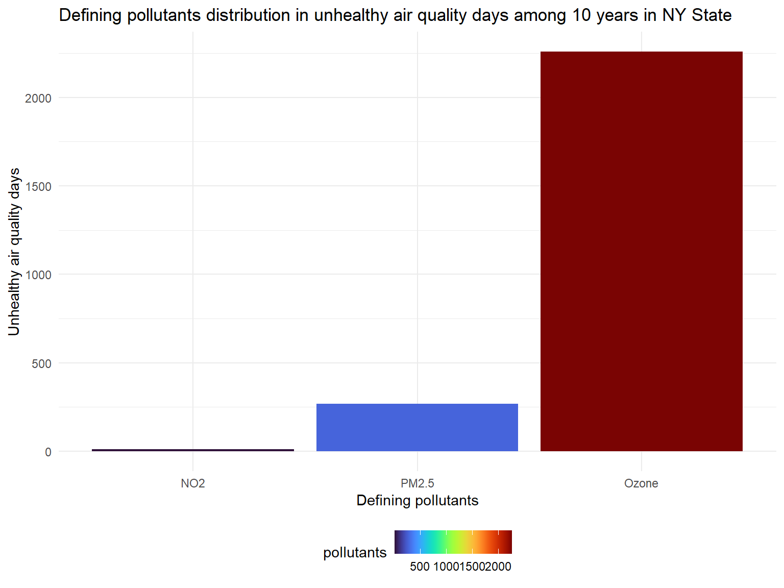
- There are nearly 3000 unhealthy days in total for counties in past 10 years.
- Based on the graph, we can know that
OzoneandPM2.5are main defining pollutants during unhealthy air days.
Ozone
Figure 7: Mean Ozone by county in NY state, 2003-2012, by counties
ozone_year_df =
  air_daily_df %>%
  select(state_code, county_code, state, county, year, mean_ozone) %>%
  group_by(state_code, county_code,county,year) %>%
  summarize(
    ozone_mean = mean(mean_ozone)
  ) %>%
  drop_na(ozone_mean)

ozone_graph =
  ozone_year_df %>%
  group_by(county) %>%
  ggplot(aes(x = year, y = ozone_mean, color = county)) +
  geom_point(alpha=.3) +
  geom_line() +
  labs(
    title = "Mean Ozone by county in NY state, 2003-2012, by counties",
    x = "Year",
    y = "Mean Ozone"
  )+
  scale_x_continuous(breaks = 2003:2012 )+
  scale_color_viridis(
    name = "County",
    discrete = TRUE
  )

ozone_graph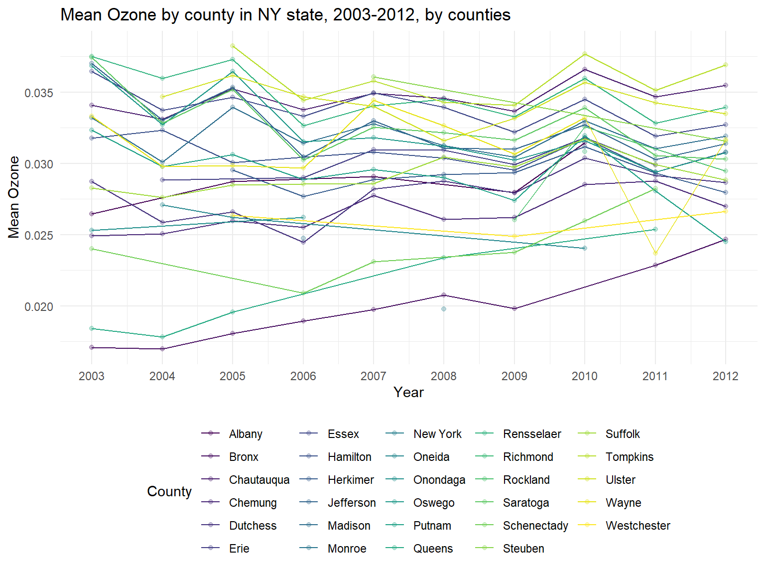
- The United States Environmental Protection Agency test ground-level
ozone. Thus, when
ozoneis increasing, air quality is worse. Based on the graph, it can be sen thatozoneConcentration is increasing among 10 years. - We can also find that some counties are with a lower
ozoneconcentration among 10 years, such asNew York,BronxandQueens. However, some counties are with higherozoneconcentration, for example,Tompkins,RensselaerandChautauqua.
Figure 8: Ozone by counties on map
ozone_county_df =
  ozone_year_df %>%
  group_by(state_code, county_code,county) %>%
  summarize(
    ozone_all = mean(ozone_mean),
    max = max(ozone_mean),
    min = min(ozone_mean)
  ) %>%
  mutate(
    fips = str_c(state_code,county_code)
  )

ozone_county_plot_map =
  plot_usmap(regions = "county", include = c("NY"), data = ozone_county_df, values = "ozone_all", labels = TRUE, label_color = "white") +
  scale_fill_continuous(
    low = "white", high = "Blue", name = "Air Quality Index", label = scales::comma, limits = c(0,0.04)
  ) +
  labs(
    title = "Ozone by counties on map"
  )+
  theme(legend.position = "right")

ozone_county_plot_map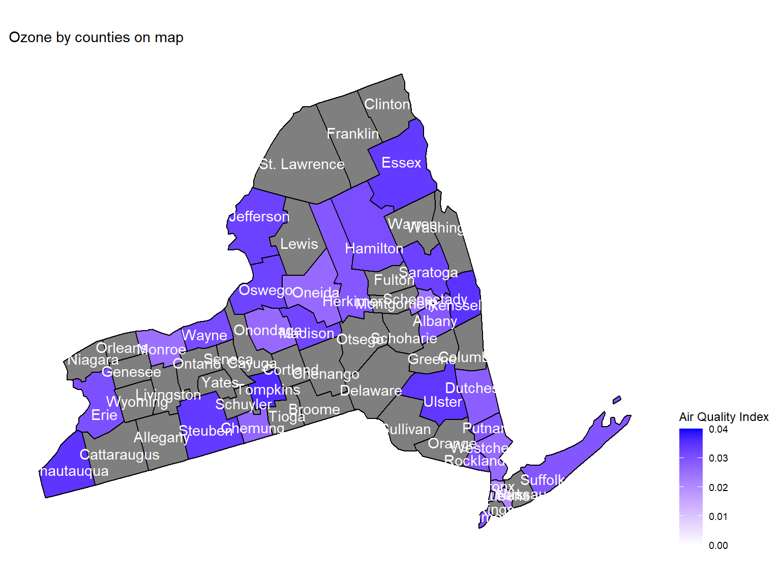
- Maps can help us directly view the
ozoneconcentration in counties. This map is based on mean ozone concentration among 10 years. According to the map, we can see thatEssex,UlsterandChautauquaare with the highest ozone concentration among 10 years.
PM2.5
Figure 9: Days for PM2.5 presence by counties within 10 years
pm2_5_county_df =
  air_daily_df %>%
  select(state_code, county_code, state, county, year, mean_pm2_5) %>%
  drop_na(mean_pm2_5) %>%
  group_by(state_code, county_code,county) %>%
  summarize(
    pm2_5 = n(),
    pm2_5_all = mean(mean_pm2_5),
    max = max(mean_pm2_5),
    min = min(mean_pm2_5)
  ) %>%
  ungroup() %>%
  arrange(pm2_5) %>%
  mutate(
    county = fct_reorder(county, pm2_5)
  )

pm2_5_county_graph =
  ggplot(pm2_5_county_df, aes(y = county, x = pm2_5, fill = pm2_5)) +
  geom_col() +
  labs(
    title = "Days for PM2.5 presence by counties within 10 years",
    x = "Days when PM2.5 can be detected",
    y = "County"
  ) +
  scale_fill_viridis(option = "turbo")

pm2_5_county_graph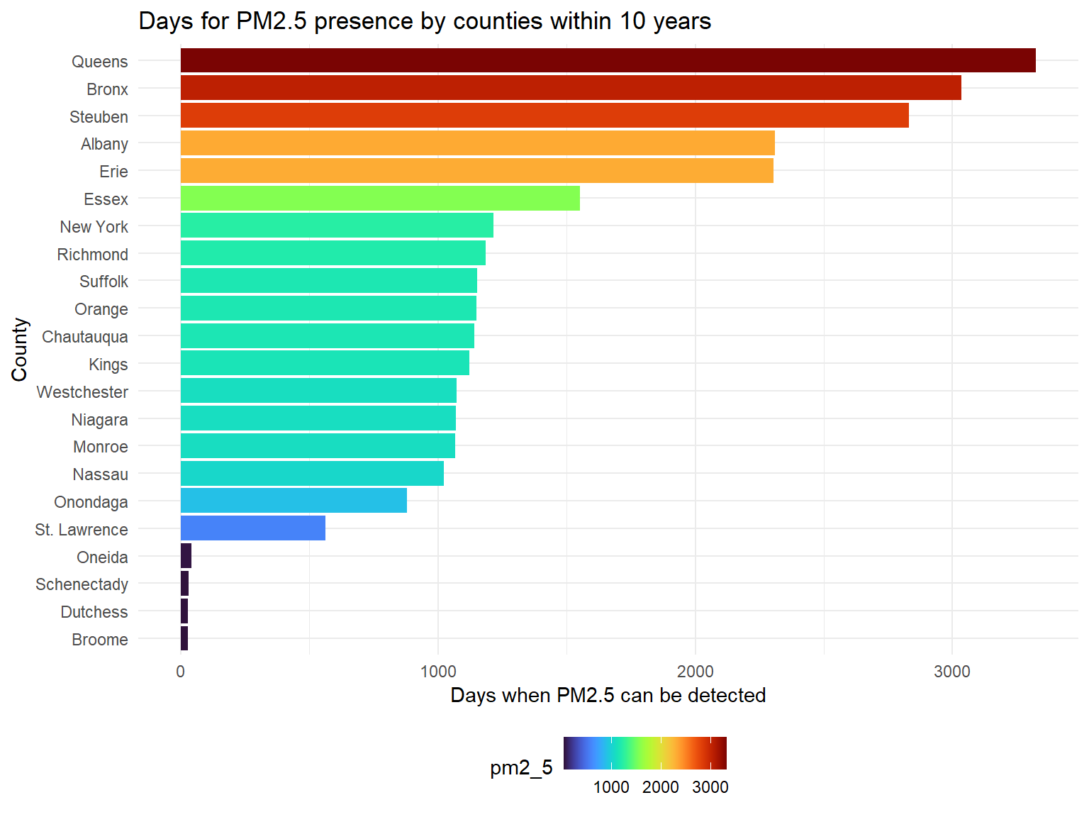
PM2.5is a harmful pollutant that will affect human health. According to the result,Queens,Bronx,Steuben,AlbanyandErieare counties with most PM2.5, whileSt. Lawrence,Oneida,Schenectady,DutchessandBroomeare hard to detect PM2.5.
Figure 10: PM2.5 distribution by counties within 10 years
pm2_5_range_df =
  pm2_5_county_df %>%
  mutate(
    county = fct_reorder(county, pm2_5_all)
  )

pm2_5_county_range_graph =
  pm2_5_range_df %>%
  group_by(county) %>%
  ggplot(aes(x = county, y = pm2_5_all)) +
  geom_point()+
  geom_errorbar(mapping = aes(ymin = min, ymax = max)) +
  labs( x = "County",  y = "PM2.5", title = "PM2.5 distribution by counties within 10 years") +
  theme(plot.title = element_text(hjust = 0.5)) +
  theme(axis.text.x = element_text(angle = 90, vjust = 0.5, hjust = 1))

pm2_5_county_range_graph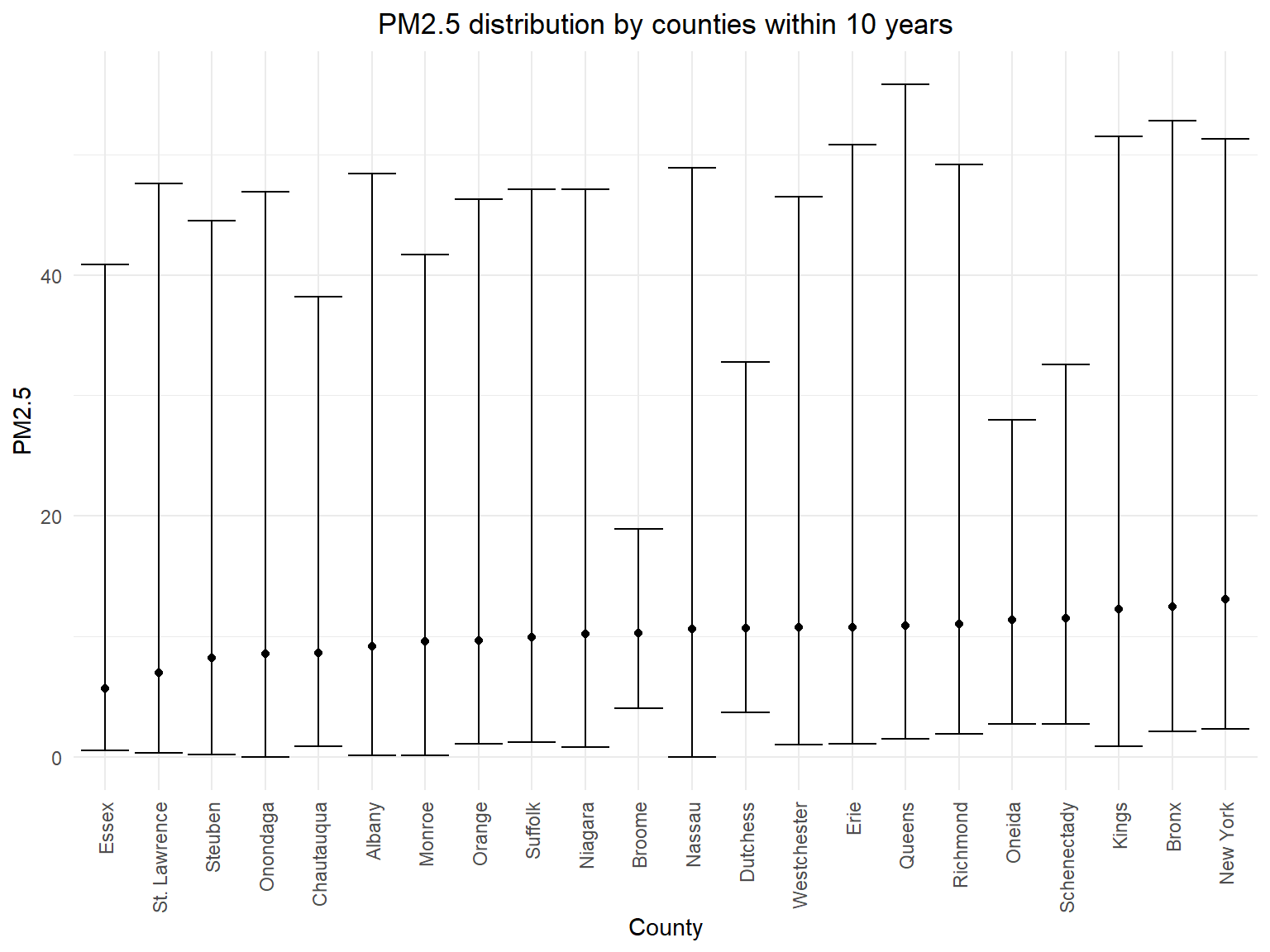
- According to the error bar graph, we can know that there isn’t much
difference for mean PM2.5 concentration among different counties in 10
years, but we can find that the ranges for PM2.5 concentration are
different.
Queensis the county with the highest PM2.5 observation.