Asthma and heart disease in NY state
Asthma
Figure 11: Trend of the rate for people who have asthma history in NY state among 10 years
asthma_history_df =
  brfss_air_df %>%
  mutate(
    fips = str_c(state_code.x,county_code)
  ) %>%
  group_by(year) %>%
  count(
    year, asthma_status
  ) %>%
  mutate(
    percent = n/sum(n),
    asthma_status = as.factor(asthma_status)
  ) %>%
  drop_na(asthma_status)

asthma_history_graph =
  asthma_history_df %>%
  filter(asthma_status != "3") %>%
  group_by(asthma_status) %>%
  ggplot(aes(x = year, y = percent, group = asthma_status, color = asthma_status)) +
  geom_smooth()+
  geom_point()+
  scale_fill_viridis(option = "viridis")+
  labs(
    title = "Trend of the rate for people who have asthma history in NY state among 10 years",
    x = "Year",
    y = "Percent of people who have asthma",
    color = "Asthma Status"
  ) +
  scale_x_continuous(breaks = 2003:2012 )

asthma_history_graph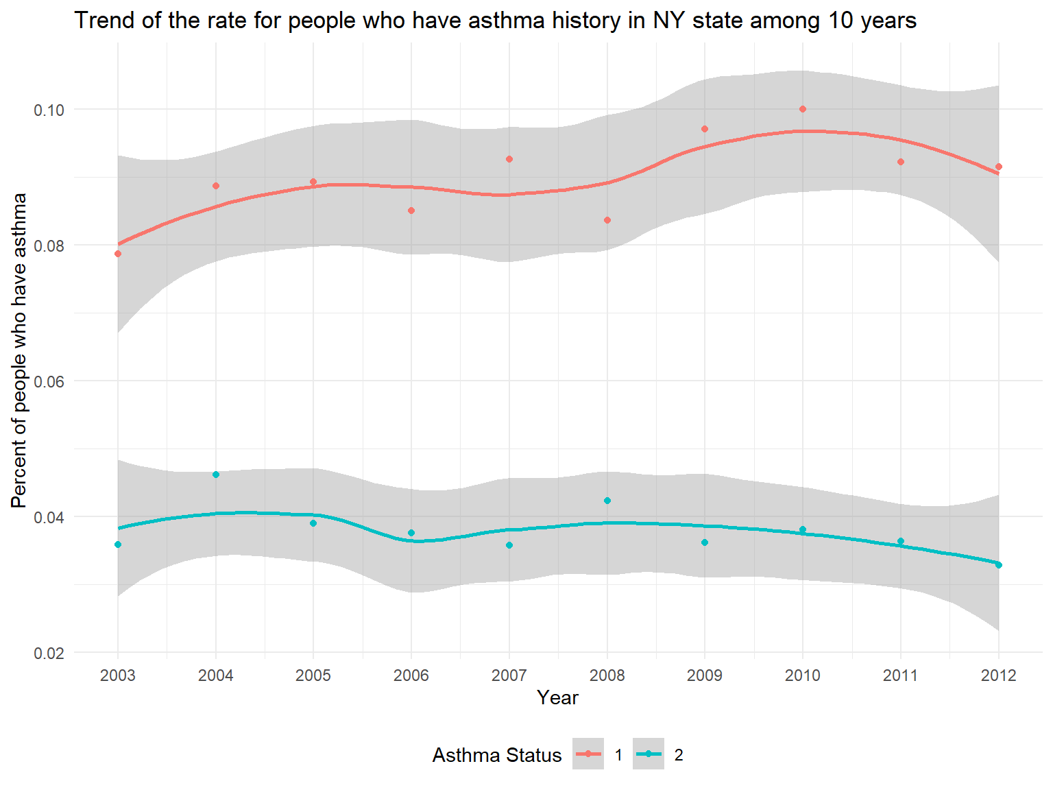
- In the graph, it can be seen that we have two Asthma Status.
Asthma 1stands forPeople who currently have asthmawhileAsthma 2stands forPeople who formerly have asthma. - According to the graph, we can know that the percentage of people who currently have asthma is higher than the percentage of people who formerly have asthma.
- While the percentage of people who formerly have asthma is decreasing, the percentage of people who currently have asthma is increasing among 10 years.
Figure 12: Map of the percentage of people who currently have asthma among 10 years
asthma_now_county_df =
  brfss_air_df %>%
  mutate(
    fips = str_c(state_code.x,county_code)
  ) %>%
  group_by(state_code.x, county_code,county,fips) %>%
  count(
    county,asthma_status
  ) %>%
  mutate(
    percent = n/sum(n)
  ) %>%
  filter(asthma_status == "1") %>%
  spread(asthma_status, percent)

asthma_now_county_plot_map =
  plot_usmap(regions = "county", include = c("NY"), data = asthma_now_county_df, values = "1", labels = TRUE, label_color = "White") +
  scale_fill_continuous(
    low = "white", high = "Orange", name = "Percentage", label = scales::comma, limits = c(0.05,0.17)
  ) +
  labs(
    title = "Map of the percentage of people who currently have asthma among 10 years"
  ) +
  theme(legend.position = "right")

asthma_now_county_plot_map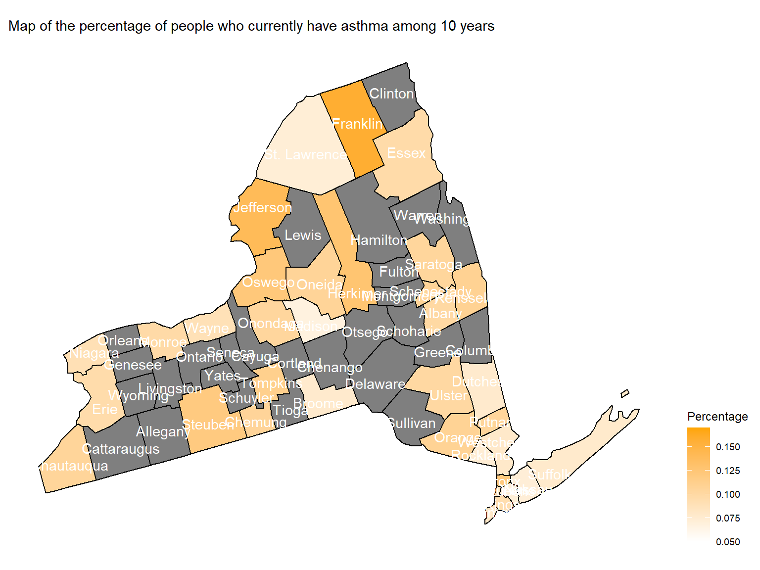
- To directly view the percentage of people who currently have asthma,
we create a map. According to the map, we can see that
Franklin,Jefferson,SteubenandBronxare with highest percentage of people who currently have asthma.
Figure 13: Trend of average doctor visits for urgent treatment of worsening asthma symptoms in counties among 10 years
asthma_visit_df =
  brfss_air_df %>%
  drop_na(asthma_visit) %>%
  filter(asthma_visit != 0) %>%
  group_by(state_code.x, county_code,county) %>%
  summarize(
    mean_asthma_visit = mean(asthma_visit),
    max_asthma_visit = max(asthma_visit),
    min_asthma_visit = min(asthma_visit)
  ) %>%
  ungroup() %>%
  arrange(mean_asthma_visit) %>%
  mutate(
    county = fct_reorder(county, mean_asthma_visit)
  )

asthma_visit_graph =
  asthma_visit_df %>%
  ggplot(aes(x = county, y = mean_asthma_visit)) +
  geom_point()+
  geom_errorbar(mapping = aes(ymin = min_asthma_visit, ymax = max_asthma_visit )) +
  labs( x = "County",  y = "Average Doctor Visits for Asthma", title = "Average doctor visits for urgent treatment of worsening asthma symptoms among 10 years") +
  theme(plot.title = element_text(hjust = 0.5)) +
  theme(axis.text.x = element_text(angle = 90, vjust = 0.5, hjust = 1))

asthma_visit_graph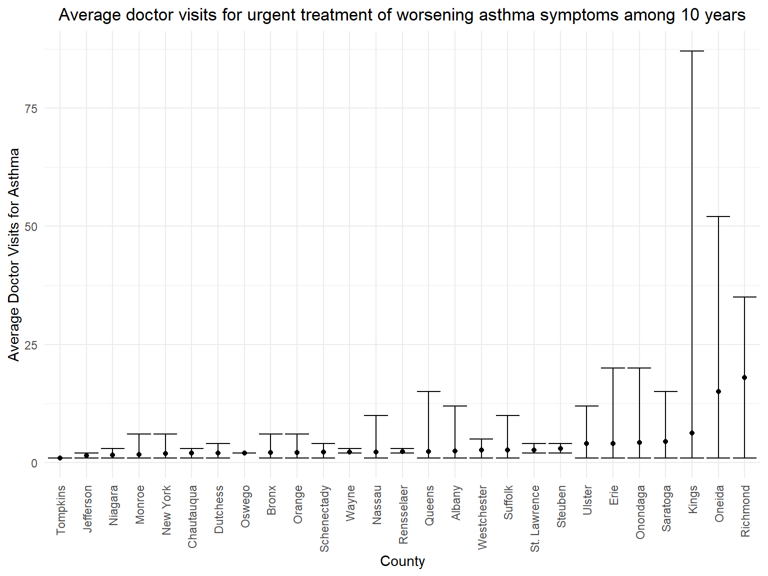
- According to the graph, we can know that people in
Richmond,OneidaandKingsare with more than 5 average doctor visits for asthma. - It seems that average doctor visits doesn’t have relationship with the percentage of people who currently have asthma. Counties which have the highest percentage of patients don’t have the highest average doctor visits for asthma.
Heart disease
Figure 14: Trend of the percentage of people who have any heart disease in NY state among 10 years
hd_history_df =
  brfss_air_df %>%
  mutate(
    fips = str_c(state_code.x,county_code),
    heart_disease = ifelse(coronary_heart_disease == "1" | heart_attack == "1" | stroke == "1", "1", "0")
  ) %>%
  group_by(year) %>%
  count(
    year, heart_disease
  ) %>%
  mutate(
    percent = n/sum(n),
    heart_disease = as.factor(heart_disease)
  ) %>%
  drop_na(heart_disease)

hd_history_graph =
 hd_history_df %>%
  filter(heart_disease == "1") %>%
  ggplot(aes(x = year, y = percent)) +
  geom_smooth()+
  geom_point()+
  scale_fill_viridis(option = "viridis")+
  labs(
    title = "Trend of the percentage of people who have any heart disease in NY state among 10 years",
    x = "Year",
    y = "Percent of people who have heart disease"
  ) +
  scale_x_continuous(breaks = 2003:2012 )

hd_history_graph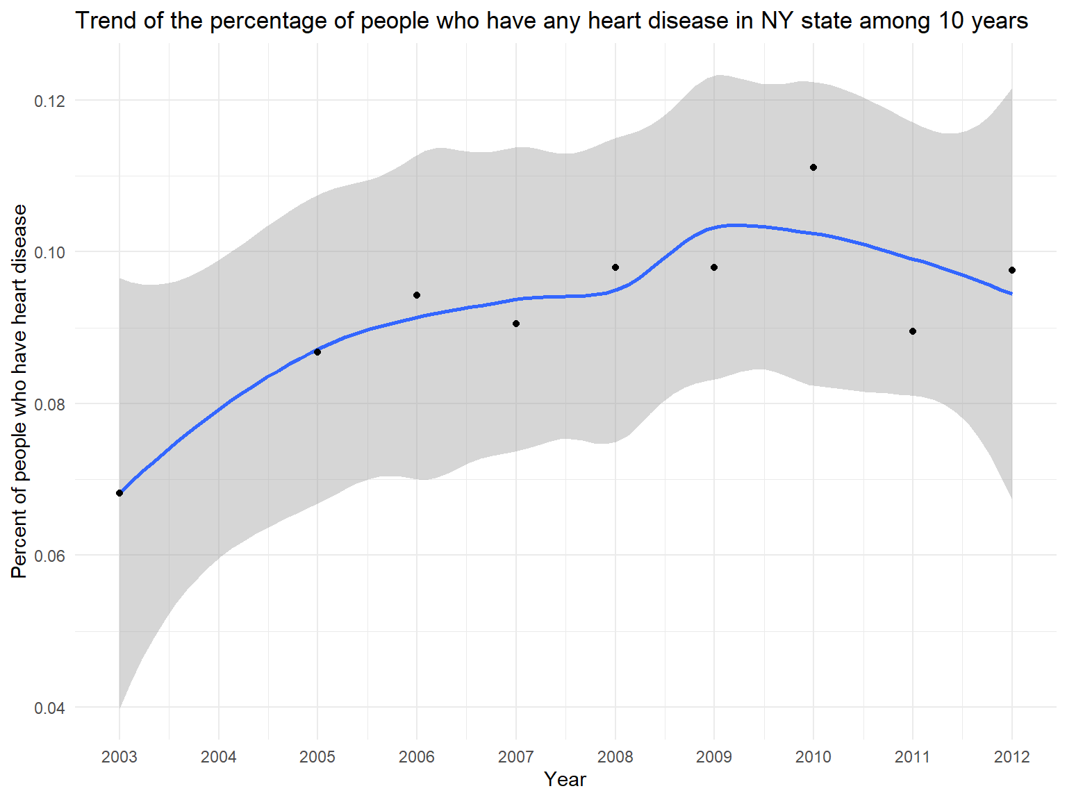
- BRFSS also includes heart disease variables. Previous research suggests that asthma might be associated with heart disease. Thus, we try to find some relationships using our dataset.
- According to this graph, we can know that the percentage of people who have heart disease(including stroke, coronary heart disease and heart attack) is increasing among 10 years.
Figure 15: Map of the percentage for people who have heart disease among 10 years
hd_county_df =
  brfss_air_df %>%
  mutate(
    fips = str_c(state_code.x,county_code),
    heart_disease = ifelse(coronary_heart_disease == "1" | heart_attack == "1" | stroke == "1", "1", "0")
  ) %>%
  group_by(state_code.x, county_code,county,fips) %>%
  count(
    year, heart_disease
  ) %>%
  mutate(
    percent = n/sum(n),
    heart_disease = as.factor(heart_disease)
  ) %>%
  drop_na(heart_disease)

hd_county_plot_map =
  plot_usmap(regions = "county", include = c("NY"), data = hd_county_df, values = "percent", labels = TRUE, label_color = "white") +
  scale_fill_continuous(
    low = "white", high = "Purple", name = "Percentage", label = scales::comma, limits = c(0,0.8)
  ) +
  labs(
    title = "Map of the percentage for people who have heart disease among 10 years"
  ) +
  theme(legend.position = "right")

hd_county_plot_map 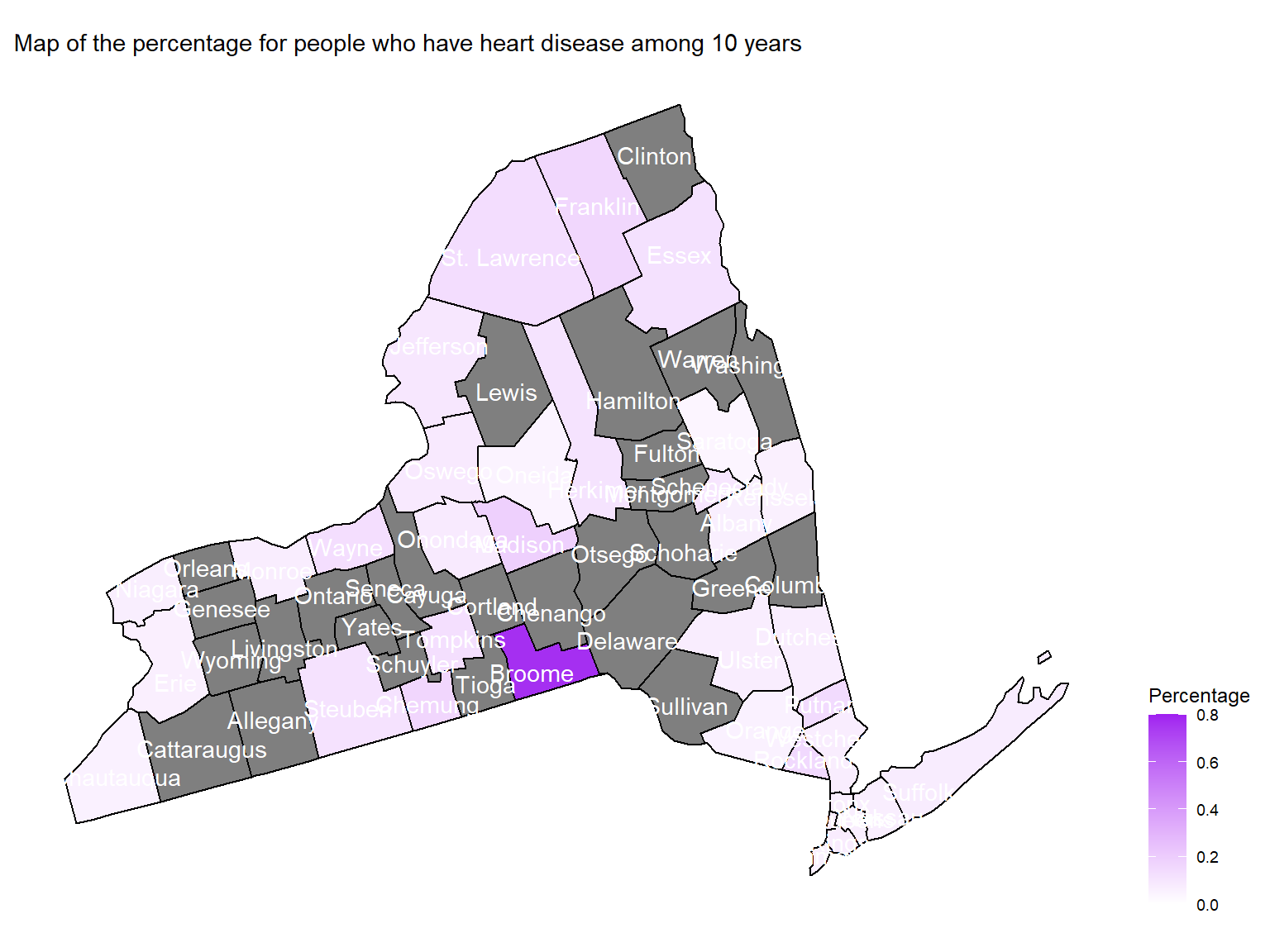
- To directly view the percentage of people who have heart disease
among 10 years, we create a map. According to the map, we can see that
Broomeare with highest percentage of people who have heart disease among 10 years.