Air Quality Index across year in NY state
- Air quality index is different among counties in 10years. We created maps with their air quality index on colors among counties in NY state.If the color is grey, that means there was no respondents in those counties at that year.
Air quality index
According to the graphs, we can know that:
- Overall, the air quality index is decreasing in 10 years in all counties, which means that the air quality is becoming better.
- Urban counties, including
Bronx,Queens,New YorkandErie, are with a higher air quality index, which means they have worse air quality. - Based on the map, we can know that air quality index might with no relationship with asthma because in northern counties in NY state, where the asthma percentage are higher, the air quality are pretty good.
2003
air_county_df1 =
  aqi_year_df %>%
  group_by(state_code, county_code,county, year) %>%
  filter(year == 2003) %>%
  summarize(
    aqi_all = mean(aqi_mean),
    max = max(aqi_mean),
    min = min(aqi_mean)
  ) %>%
  mutate(
    fips = str_c(state_code,county_code)
  )

county_plot_map1 =
  plot_usmap(regions = "county", include = c("NY"), data = air_county_df1, values = "aqi_all", labels = TRUE, label_color = "White") +
  scale_fill_continuous(
    low = "white", high = "Red", name = "AQI", label = scales::comma, limits = c(0,60)
  ) +
  theme(legend.position = "right")

county_plot_map1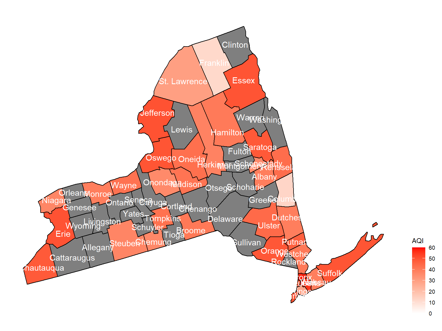
2004
air_county_df2 =
  aqi_year_df %>%
  group_by(state_code, county_code,county, year) %>%
  filter(year == 2004) %>%
  summarize(
    aqi_all = mean(aqi_mean),
    max = max(aqi_mean),
    min = min(aqi_mean)
  ) %>%
  mutate(
    fips = str_c(state_code,county_code)
  )

county_plot_map2 =
  plot_usmap(regions = "county", include = c("NY"), data = air_county_df2, values = "aqi_all", labels = TRUE, label_color = "White") +
  scale_fill_continuous(
    low = "white", high = "Red", name = "AQI", label = scales::comma, limits = c(0,60)
  ) +
  theme(legend.position = "right")

county_plot_map2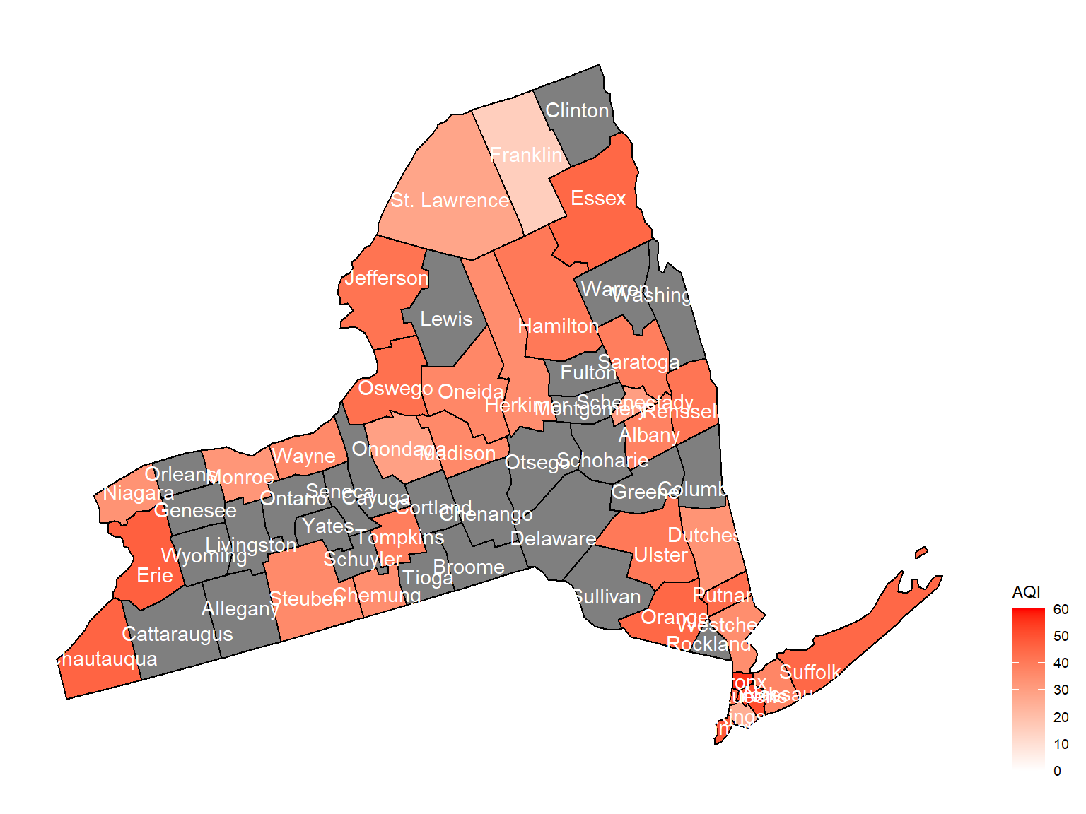
2005
air_county_df3 =
  aqi_year_df %>%
  group_by(state_code, county_code,county, year) %>%
  filter(year == 2005) %>%
  summarize(
    aqi_all = mean(aqi_mean),
    max = max(aqi_mean),
    min = min(aqi_mean)
  ) %>%
  mutate(
    fips = str_c(state_code,county_code)
  )

county_plot_map3 =
  plot_usmap(regions = "county", include = c("NY"), data = air_county_df3, values = "aqi_all", labels = TRUE, label_color = "White") +
  scale_fill_continuous(
    low = "white", high = "Red", name = "AQI", label = scales::comma, limits = c(0,60)
  ) +
  theme(legend.position = "right")

county_plot_map3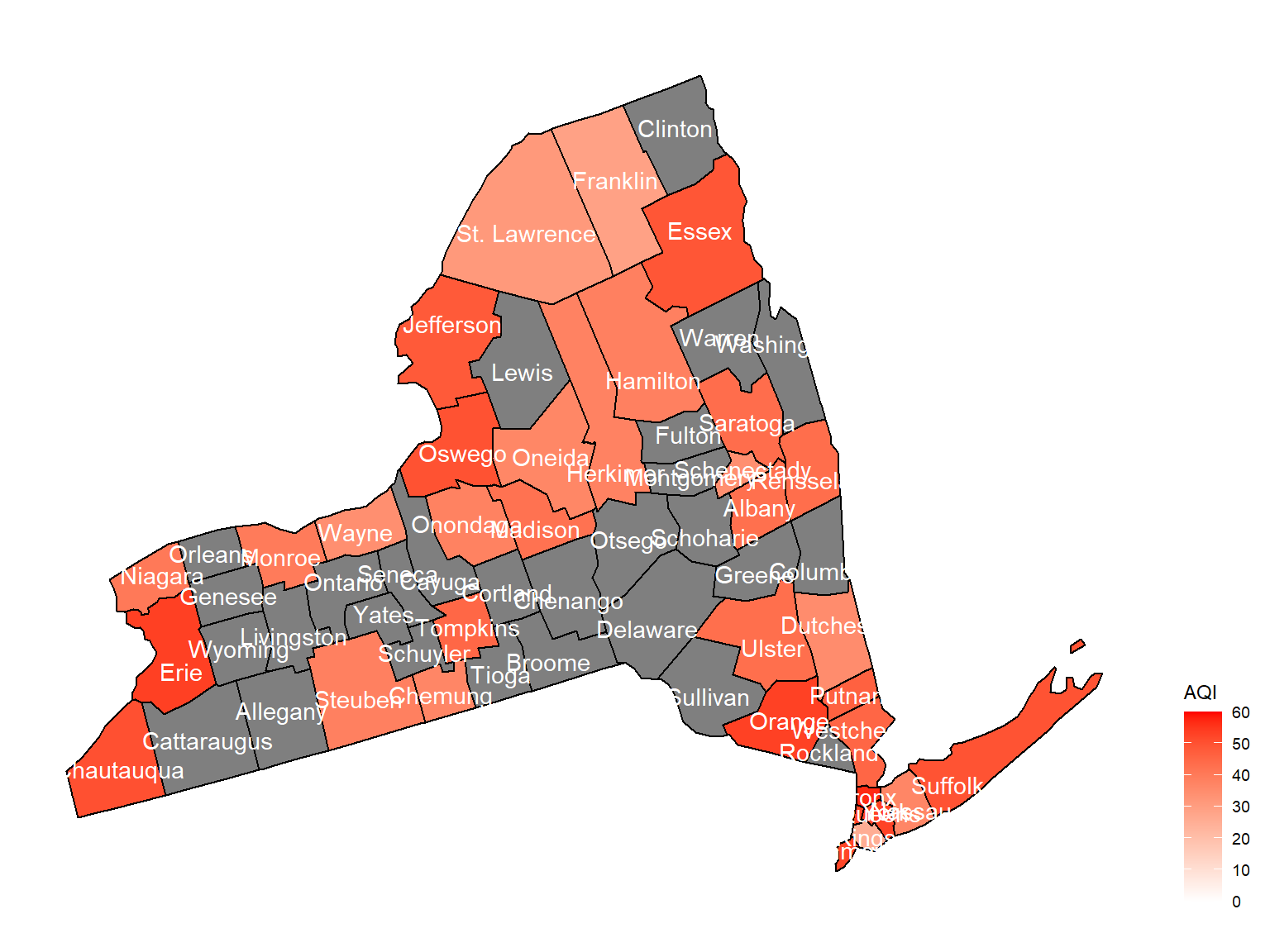
2006
air_county_df4 =
  aqi_year_df %>%
  group_by(state_code, county_code,county, year) %>%
  filter(year == 2006) %>%
  summarize(
    aqi_all = mean(aqi_mean),
    max = max(aqi_mean),
    min = min(aqi_mean)
  ) %>%
  mutate(
    fips = str_c(state_code,county_code)
  )

county_plot_map4 =
  plot_usmap(regions = "county", include = c("NY"), data = air_county_df4, values = "aqi_all", labels = TRUE, label_color = "White") +
  scale_fill_continuous(
    low = "white", high = "Red", name = "AQI", label = scales::comma, limits = c(0,60)
  ) +
  theme(legend.position = "right")

county_plot_map4
2007
air_county_df5 =
  aqi_year_df %>%
  group_by(state_code, county_code,county, year) %>%
  filter(year == 2007) %>%
  summarize(
    aqi_all = mean(aqi_mean),
    max = max(aqi_mean),
    min = min(aqi_mean)
  ) %>%
  mutate(
    fips = str_c(state_code,county_code)
  )

county_plot_map5 =
  plot_usmap(regions = "county", include = c("NY"), data = air_county_df5, values = "aqi_all", labels = TRUE, label_color = "White") +
  scale_fill_continuous(
    low = "white", high = "Red", name = "AQI", label = scales::comma, limits = c(0,60)
  ) +
  theme(legend.position = "right")

county_plot_map5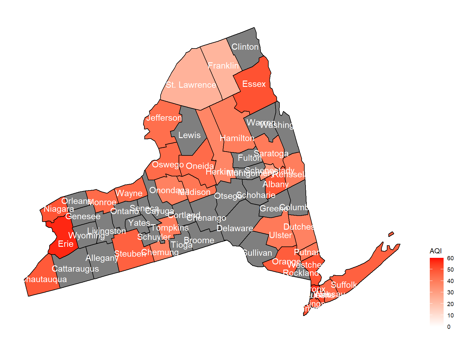
2008
air_county_df6 =
  aqi_year_df %>%
  group_by(state_code, county_code,county, year) %>%
  filter(year == 2008) %>%
  summarize(
    aqi_all = mean(aqi_mean),
    max = max(aqi_mean),
    min = min(aqi_mean)
  ) %>%
  mutate(
    fips = str_c(state_code,county_code)
  )

county_plot_map6 =
  plot_usmap(regions = "county", include = c("NY"), data = air_county_df6, values = "aqi_all", labels = TRUE, label_color = "White") +
  scale_fill_continuous(
    low = "white", high = "Red", name = "AQI", label = scales::comma, limits = c(0,60)
  ) +
  theme(legend.position = "right")

county_plot_map6
2009
air_county_df7 =
  aqi_year_df %>%
  group_by(state_code, county_code,county, year) %>%
  filter(year == 2009) %>%
  summarize(
    aqi_all = mean(aqi_mean),
    max = max(aqi_mean),
    min = min(aqi_mean)
  ) %>%
  mutate(
    fips = str_c(state_code,county_code)
  )

county_plot_map7 =
  plot_usmap(regions = "county", include = c("NY"), data = air_county_df7, values = "aqi_all", labels = TRUE, label_color = "White") +
  scale_fill_continuous(
    low = "white", high = "Red", name = "AQI", label = scales::comma, limits = c(0,60)
  ) +
  theme(legend.position = "right")

county_plot_map7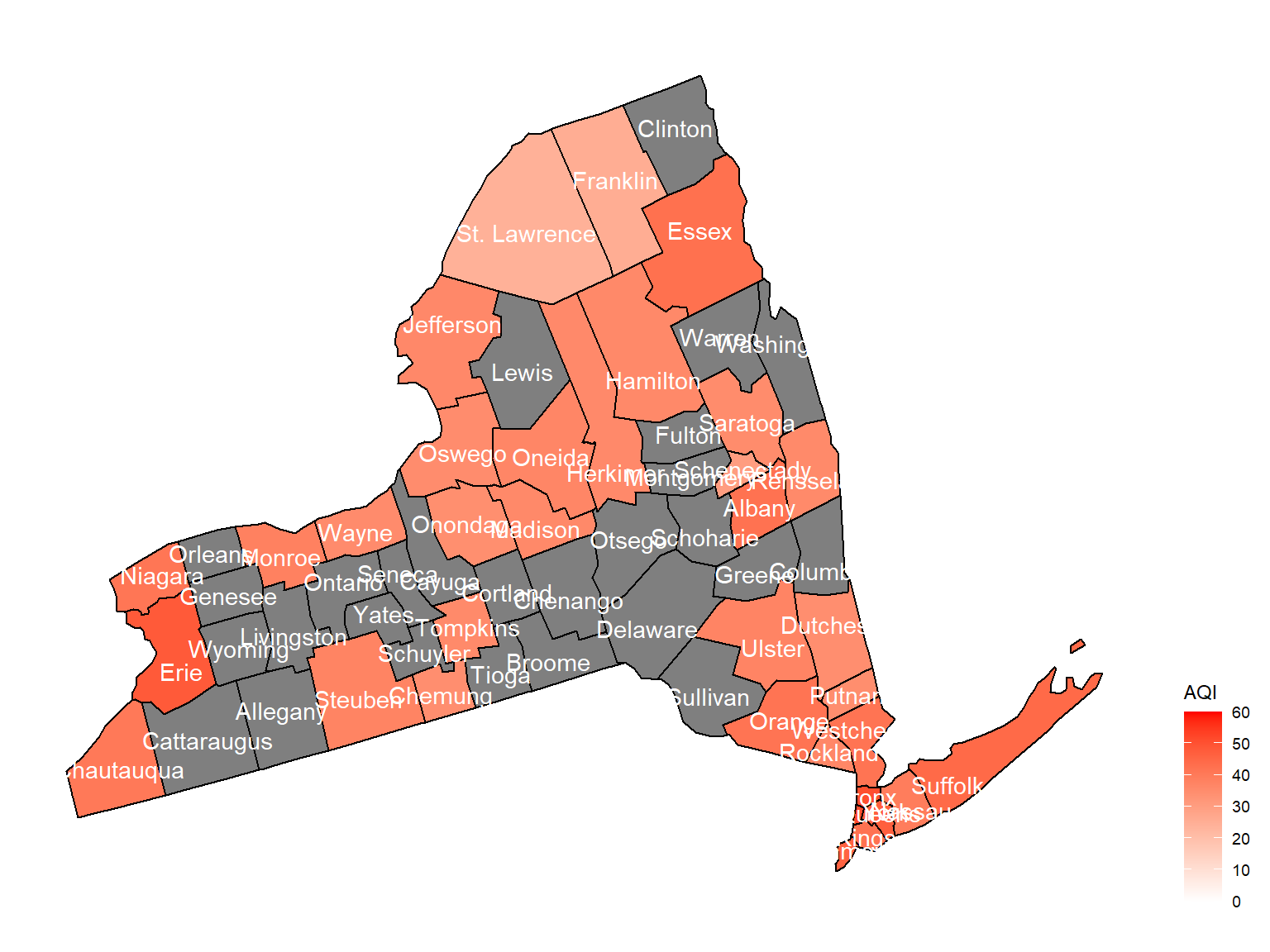
2010
air_county_df8 =
  aqi_year_df %>%
  group_by(state_code, county_code,county, year) %>%
  filter(year == 2010) %>%
  summarize(
    aqi_all = mean(aqi_mean),
    max = max(aqi_mean),
    min = min(aqi_mean)
  ) %>%
  mutate(
    fips = str_c(state_code,county_code)
  )

county_plot_map8 =
  plot_usmap(regions = "county", include = c("NY"), data = air_county_df8, values = "aqi_all", labels = TRUE, label_color = "White") +
  scale_fill_continuous(
    low = "white", high = "Red", name = "AQI", label = scales::comma, limits = c(0,60)
  ) +
  theme(legend.position = "right")

county_plot_map8
2011
air_county_df9 =
  aqi_year_df %>%
  group_by(state_code, county_code,county, year) %>%
  filter(year == 2011) %>%
  summarize(
    aqi_all = mean(aqi_mean),
    max = max(aqi_mean),
    min = min(aqi_mean)
  ) %>%
  mutate(
    fips = str_c(state_code,county_code)
  )

county_plot_map9 =
  plot_usmap(regions = "county", include = c("NY"), data = air_county_df9, values = "aqi_all", labels = TRUE, label_color = "White") +
  scale_fill_continuous(
    low = "white", high = "Red", name = "AQI", label = scales::comma, limits = c(0,60)
  ) +
  theme(legend.position = "right")

county_plot_map9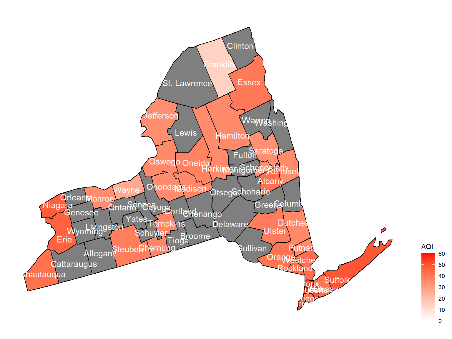
2012
air_county_df10 =
  aqi_year_df %>%
  group_by(state_code, county_code,county, year) %>%
  filter(year == 2012) %>%
  summarize(
    aqi_all = mean(aqi_mean),
    max = max(aqi_mean),
    min = min(aqi_mean)
  ) %>%
  mutate(
    fips = str_c(state_code,county_code)
  )

county_plot_map10 =
  plot_usmap(regions = "county", include = c("NY"), data = air_county_df10, values = "aqi_all", labels = TRUE, label_color = "White") +
  scale_fill_continuous(
    low = "white", high = "Red", name = "AQI", label = scales::comma, limits = c(0,60)
  ) +
  theme(legend.position = "right")

county_plot_map10